
San Marcos Animal Shelter
Adopt your next best friend!


Role
UX/UI designer + Brand designer
Tools Used
Figma + Whimsical + Figjam + Otter.ai + Maze
Project Type
Responsive, redesign of website
Timeline
2 months
The Problem
The lack of responsiveness in the layout made it difficult to view pet profile pictures on a laptop, limiting the number of pets a user could explore. Users were also unable to filter available animals by key criteria such as breed, size, age, or temperament. This limitation posed a challenge for prospective pet owners in finding a suitable match quickly. The original design, by hindering users from accessing relevant information and discovering suitable pets, contributed to lower adoption rates and reduced community engagement.
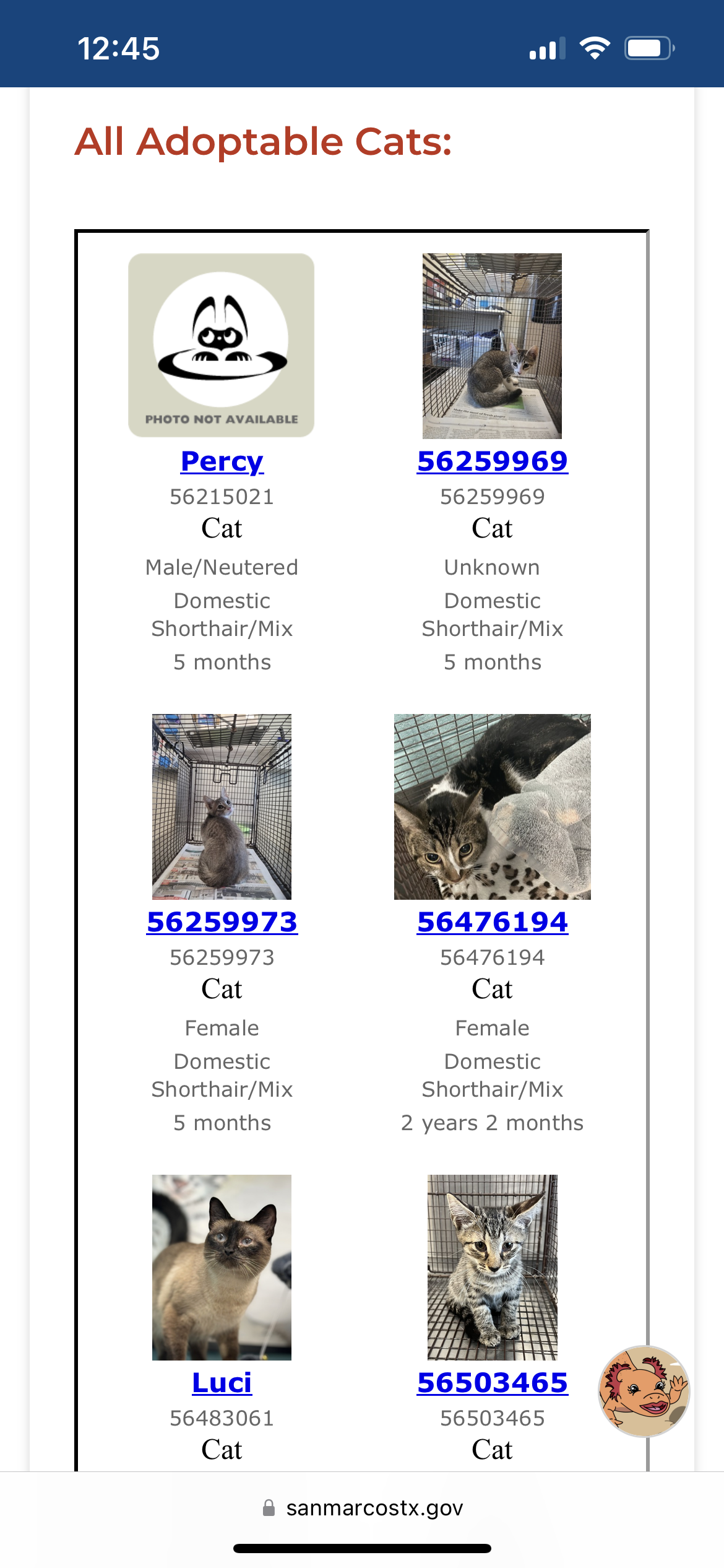
Before redesign

The Solution
Our redesign focused on these key areas to create a more user-friendly experience that encourages visitors to explore, connect with the animals, and ultimately consider adoption
Research Phase
Competitive Analysis
During our competitive analysis, we identified potential competitors and assessed their strengths and weaknesses. We reviewed several animal shelter websites to compare their designs and the information provided to users. We discovered various methods shelters used to display adoptable animals and related details. Additionally, we observed a broad range of filter options, with some shelters allowing users to filter only by pet type, while others offered more than 20 different filter criteria.
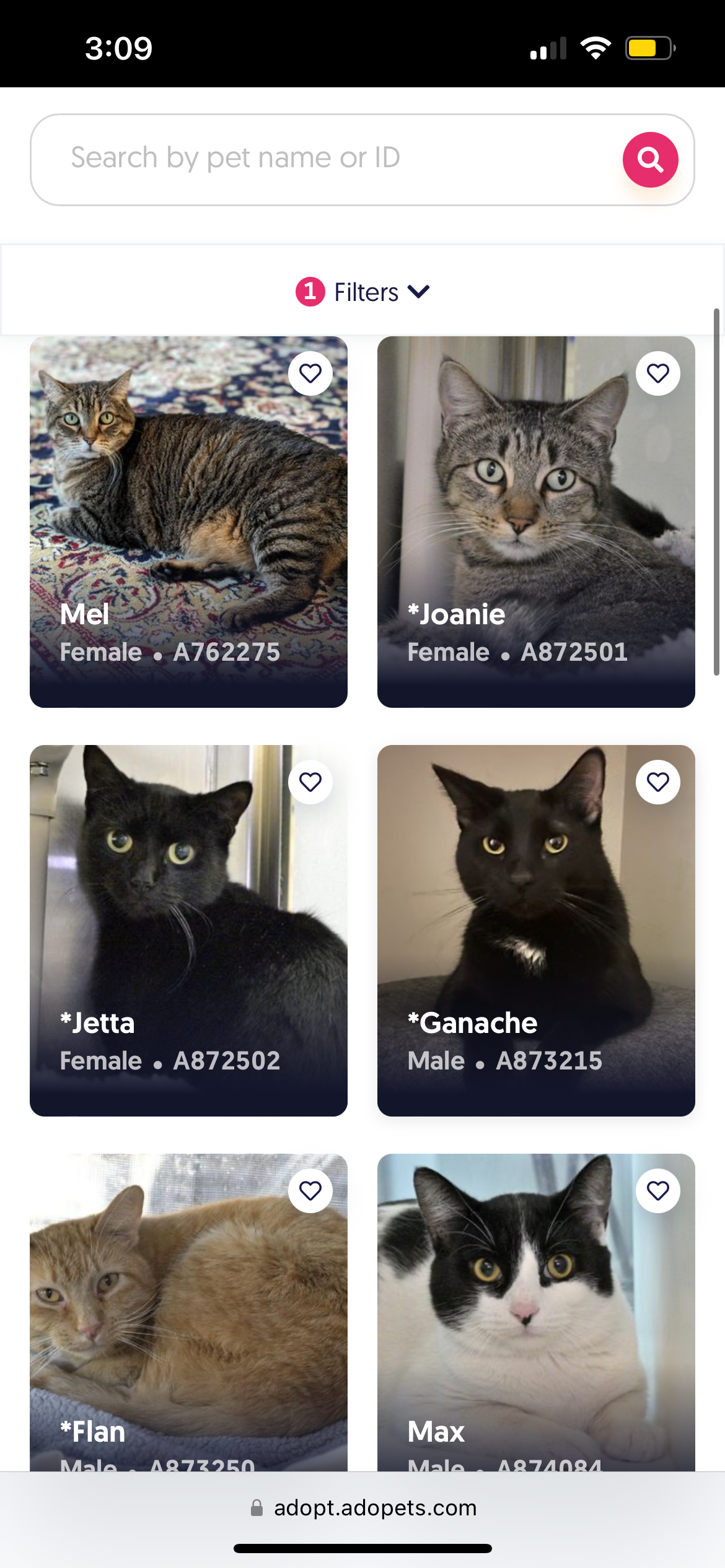
The Austin Animal Center made it easy for users to view pictures of adoptable animals. However, users were provided with minimal information during browsing and had to visit each pet's profile to learn more than just the pet's gender.
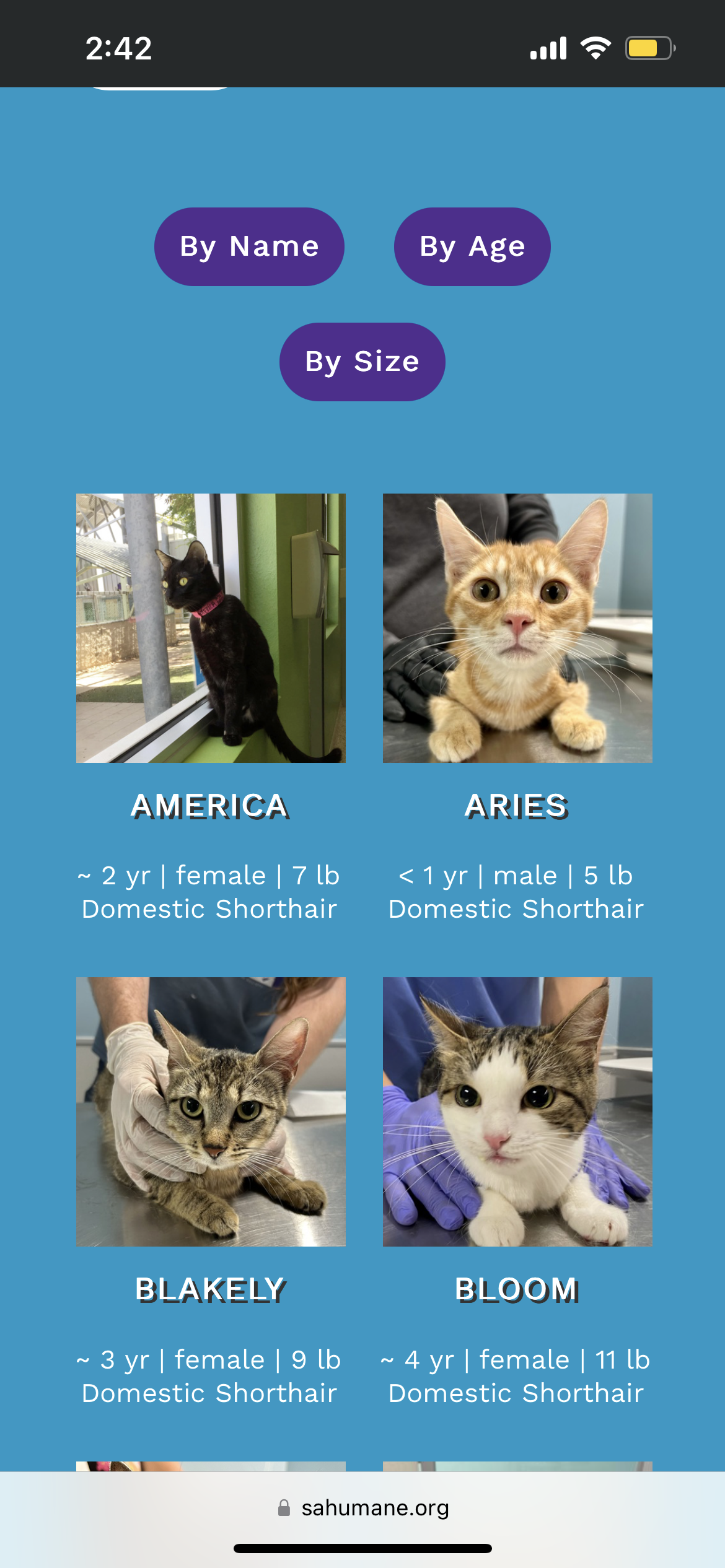
The San Antonio Humane Society provided basic information for each adoptable pet, but offered limited filter options. This made it more challenging for potential adopters to sort through pets and find one that suited their home.
In interviews with five pet owners who adopted from various shelters, most explored multiple websites before deciding. Pictures showcasing a pet's personality were crucial, and several suggested that videos could enhance understanding. Common search filters included age, breed, size, and compatibility with other pets. Behavioral details, such as interactions in public or with children, were also important. Many were willing to travel to shelters that provided detailed information. New pet owners sought guidance on the best breed or age for their lifestyle. The adoption process varied greatly between shelters, and participants wished for clearer steps upfront. Transparency about a pet's behavior was deemed essential, as some stopped browsing due to insufficient information.
User Interviews
“Age and energy level, even though that's kind of hard to know in the shelter, previous experience with other animals, kids, all that, I think, is very beneficial.”
- Pet owner
“I was hoping to find one who was active and got along well with other dogs.”
- Pet owner
Insight: When adopting a pet, people often look for specific characteristics such as weight range and compatibility with existing family members.
“If shelters would upload a small 10-second or 30-second video of the dog in addition to pictures. It would show more personality.”
- Pet owner
“We also had to ensure that he was going to get along well with Jack [dog] who was already a member of our family.”
- Pet owner
Insight: Personality plays a significant role in pet adoption decisions. Information about a pet's behavior and personality, along with videos showcasing these traits, can encourage potential adopters to visit and consider adopting a pet.

After conducting thorough interviews with pet owners who adopted from a shelter, we found that potential adopters are likely to consider other shelters if the website does not provide the information they need about adoptable pets. These interviews reinforce the insights from our competitive analysis, highlighting an opportunity to create a solution to address this issue.
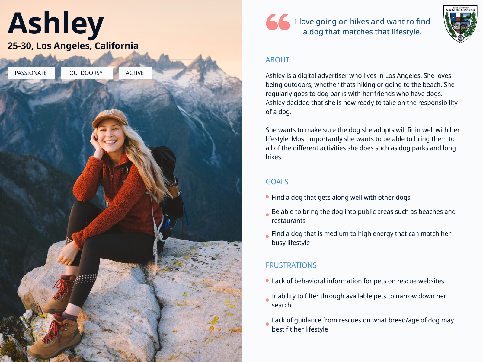
User Personas
Developing user personas was crucial to ensure we focused on what mattered most to users. We aimed to consider not only the primary persona but also the secondary persona.
Primary Persona

Secondary Persona
Ideation
POVs & HMWs
POV: We would like to improve the search functionality for potential adopters looking for pets.
POV: We would like to explore ways to increase the accessibility of our website.
How might we increase the chances of a user finding the perfect pet for them?
How might we best organize shelter information to make easily accessible to users?
How might we sort the available pets on the website?
How might we add filters that will allow users to better find pets that fit their wants/needs?
How might we ensure our website is easy to navigate?
How might we assist potential adopters in their search?
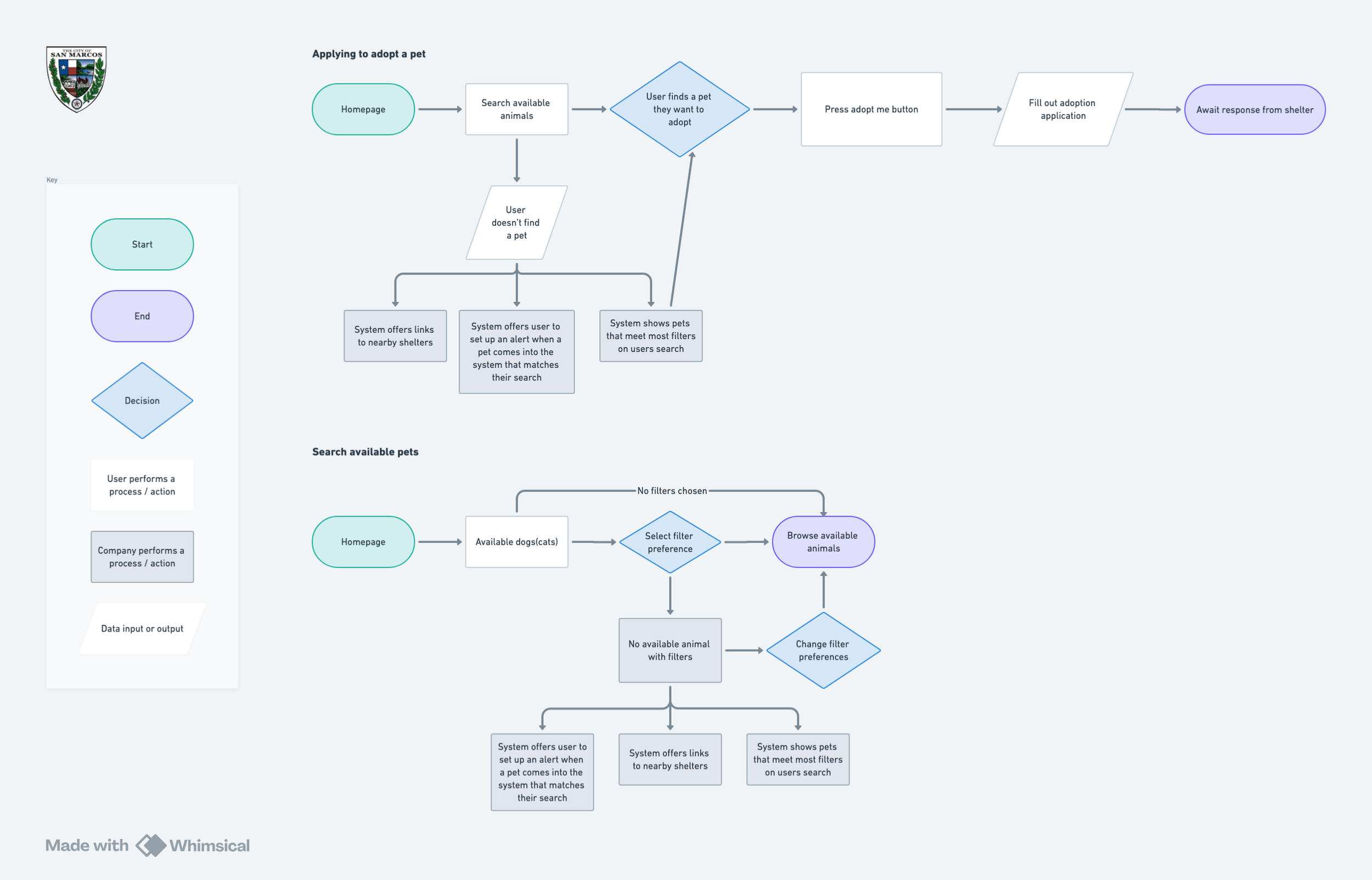
User Flows
User flows were created, with two prioritized based on their importance in helping users find and adopt a pet.
User flows: Apply to adopt a pet. Search through available pets
Wireframes
Low-fi wireframes
Wireframes were initially created at a low-fidelity level and iterated upon, gradually evolving into high-fidelity wireframes and prototypes for user testing.
By experimenting with various low-fidelity wireframes, we explored different designs to identify the one that offered the best user flow. It was essential to prioritize the primary goals of our users during this process. Along the way, we discovered a more efficient way to organize the information users needed. Additionally, we focused on supporting the business's objectives of increasing site traffic and boosting adoption rates.

Figma was used to create digital wireframes from the initial sketches, allowing for a more precise and interactive representation of the design. This tool enabled us to quickly iterate on the wireframes, making adjustments in real-time and facilitating collaboration among team members. By using Figma, we were able to efficiently transition from concept to digital format, ensuring a smoother development process and providing a clear foundation for the high-fidelity prototypes.

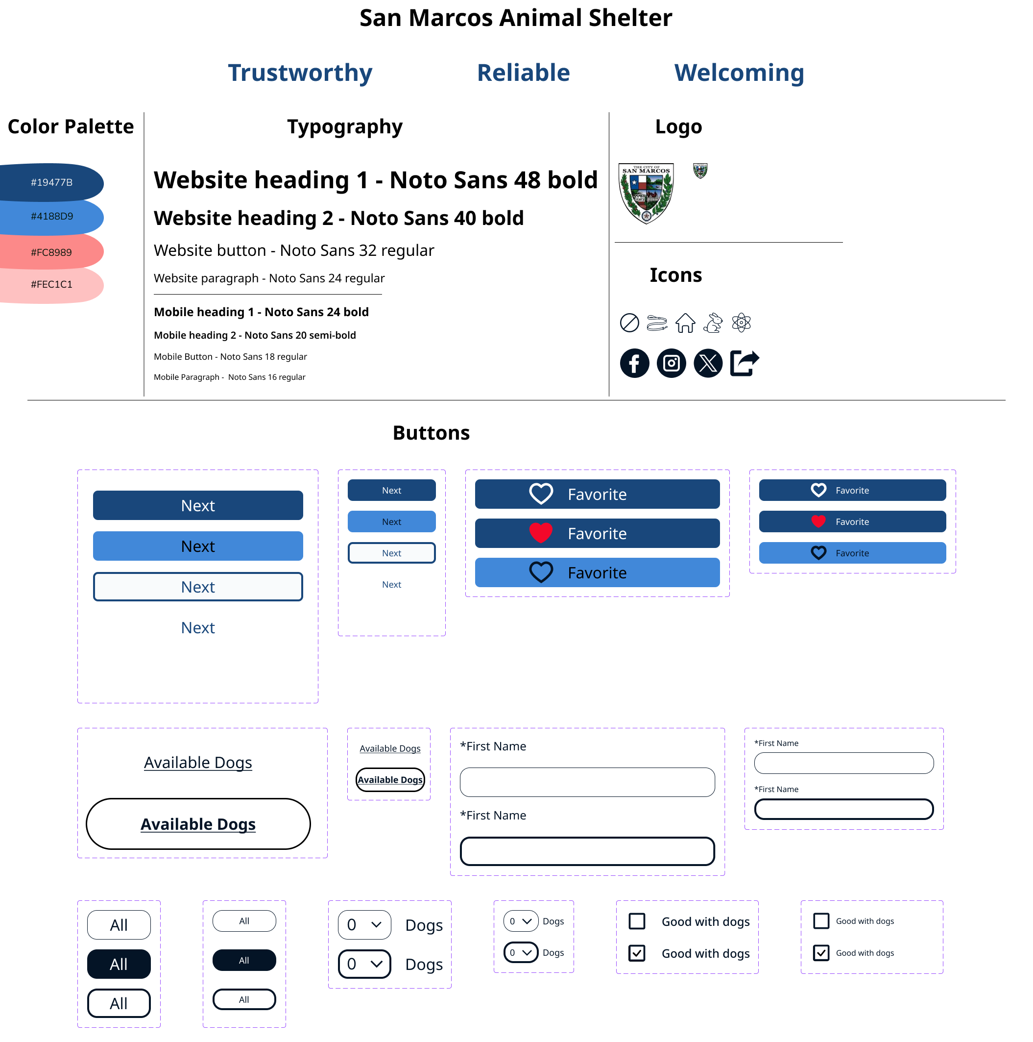
Design & Branding
UI Components
When selecting UI components, it was essential to ensure they were not only easy to understand but also designed to capture the user's attention effectively. The primary goal was to create intuitive navigation that would guide users effortlessly through the interface, making it simple for them to find what they were looking for. By prioritizing clarity and visual appeal, we aimed to enhance the overall user experience and minimize any potential frustration.
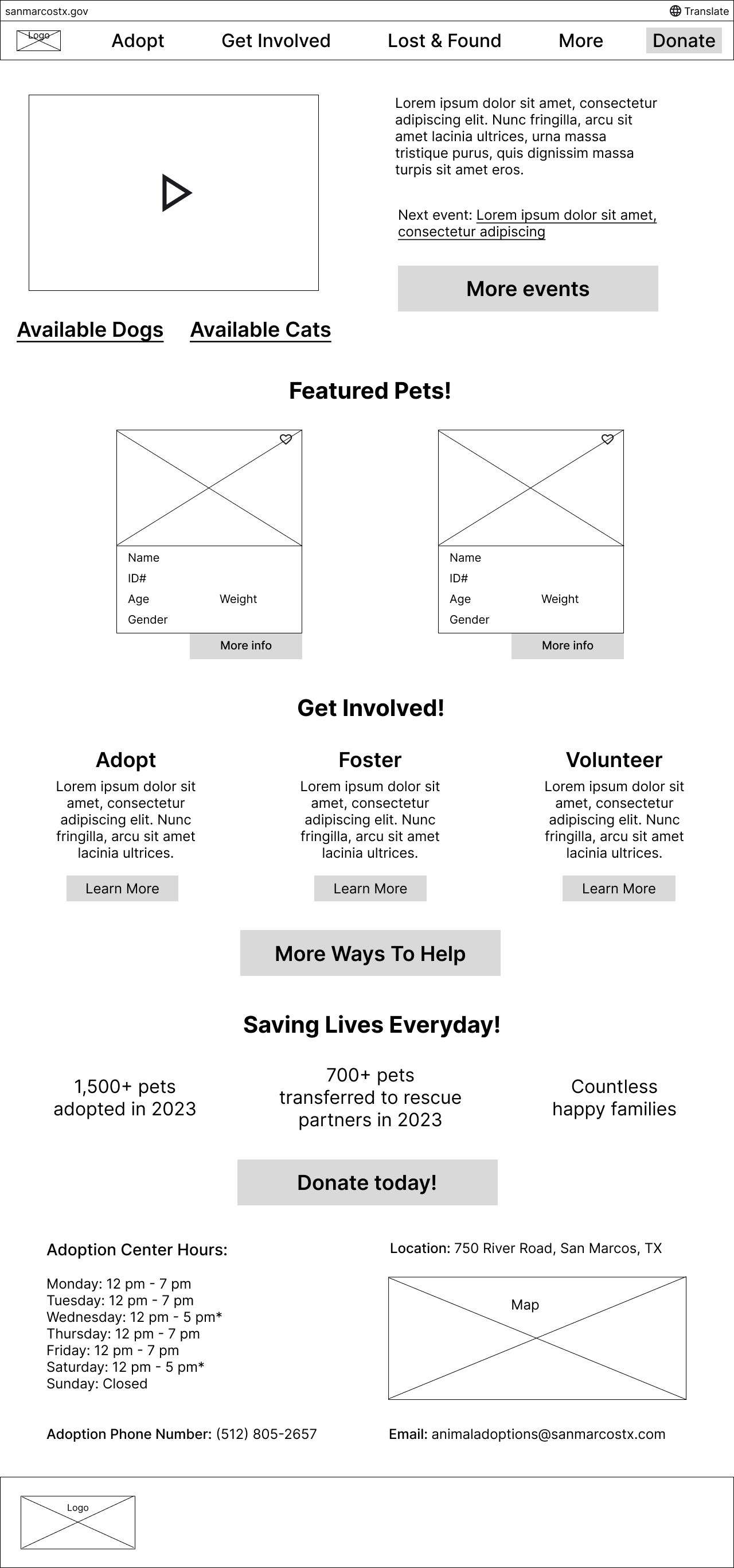
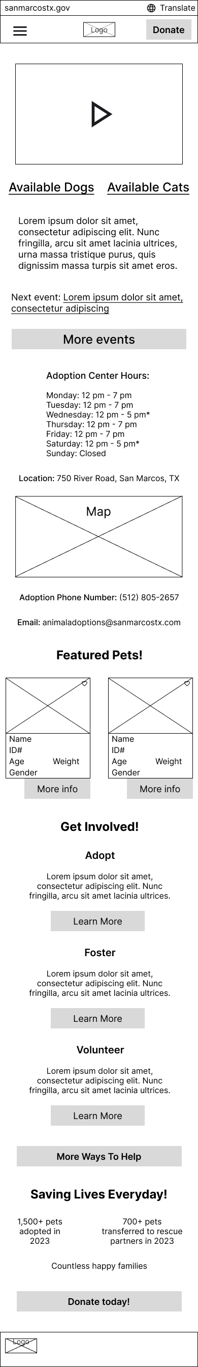
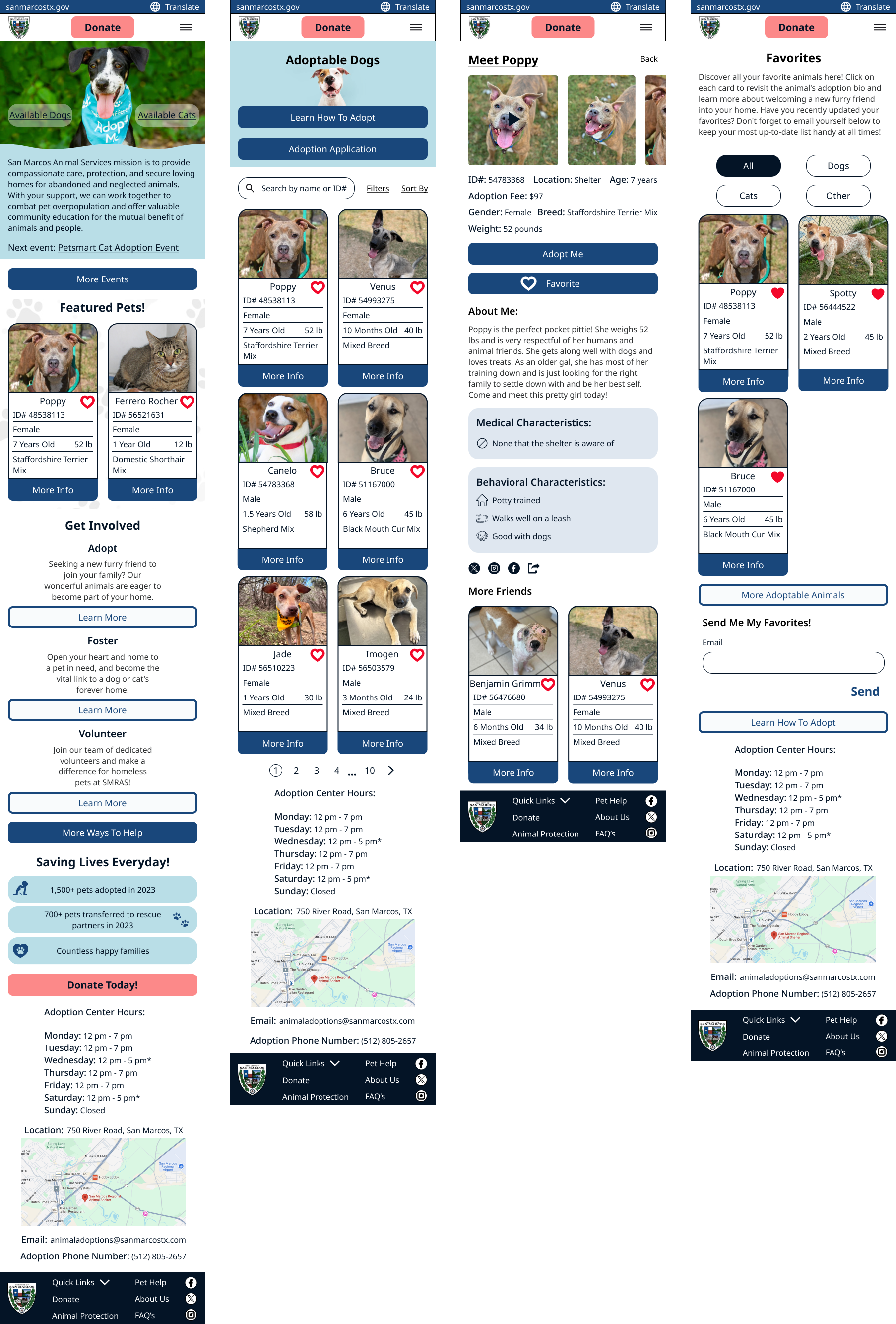
Hi-Fi Mockups
Once the UI components were finalized, we iterated on our initial designs. Keeping the user in mind, we refined the low-fi wireframes, which led to the creation of our first high-fidelity wireframes.
Improve spacing and hierarchy
For the high-fidelity wireframes, we reorganized the homepage to improve the visual hierarchy. Additionally, we adjusted the size of the adoptable pet cards to make it easier for users to view both pictures and information without overcrowding.


Prototype Testing & Iterations
User Testing
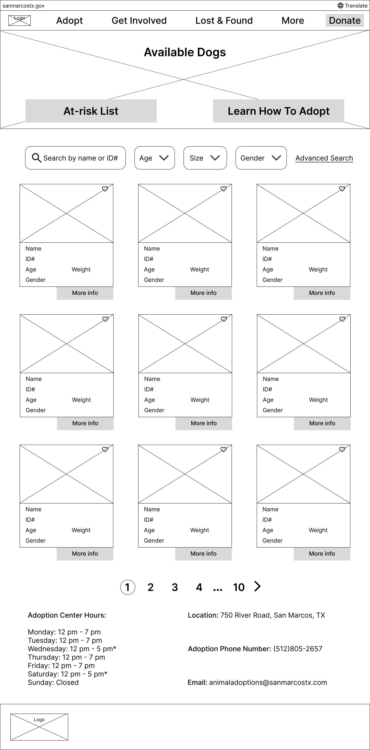
We tested the primary user flows on both mobile and desktop platforms. The first flow involved browsing adoptable dogs, navigating to a dog's profile, and favoriting that pet. The second flow included accessing the favorites list, finding Bruce, and applying to adopt him. We conducted unmoderated tests of the prototypes, created in Figma, using the Maze platform, which allowed more users to participate at their convenience. A total of six users took part in the testing of these prototypes.
User feedback highlighted that while most buttons were visible, the back button could be more prominent, and the "available dogs" button lacked visibility on both desktop and mobile. Some users were confused by the underlined "meet ___" link on pet profiles, and suggested repositioning or removing the ID# on pet cards. For the second task, users found navigation easy and forms seamless, but requested more spacing on mobile and auto-filling pet details during the application.
Below are the significant changes made based on user feedback and results.
Problem #1: Users suggested modifying the button UI to highlight its importance.
Proposed solution: The buttons have been redesigned to create a clearer distinction between primary, secondary, and tertiary buttons.


Problem #2: Users found the pet cards to be crowded, and felt that the pet's name needed to be more prominent.
Proposed solution: The pet card was redesigned to remove the pet ID# because it was considered less important to users, while placing greater emphasis on the pet's name.


Problem #3: Users were confused by the underlined 'meet ___,' which led some to believe it was clickable. They also expressed a preference for the pet's name to be centered.
Proposed solution: The pet's name was centered on the page, and the underline was removed.


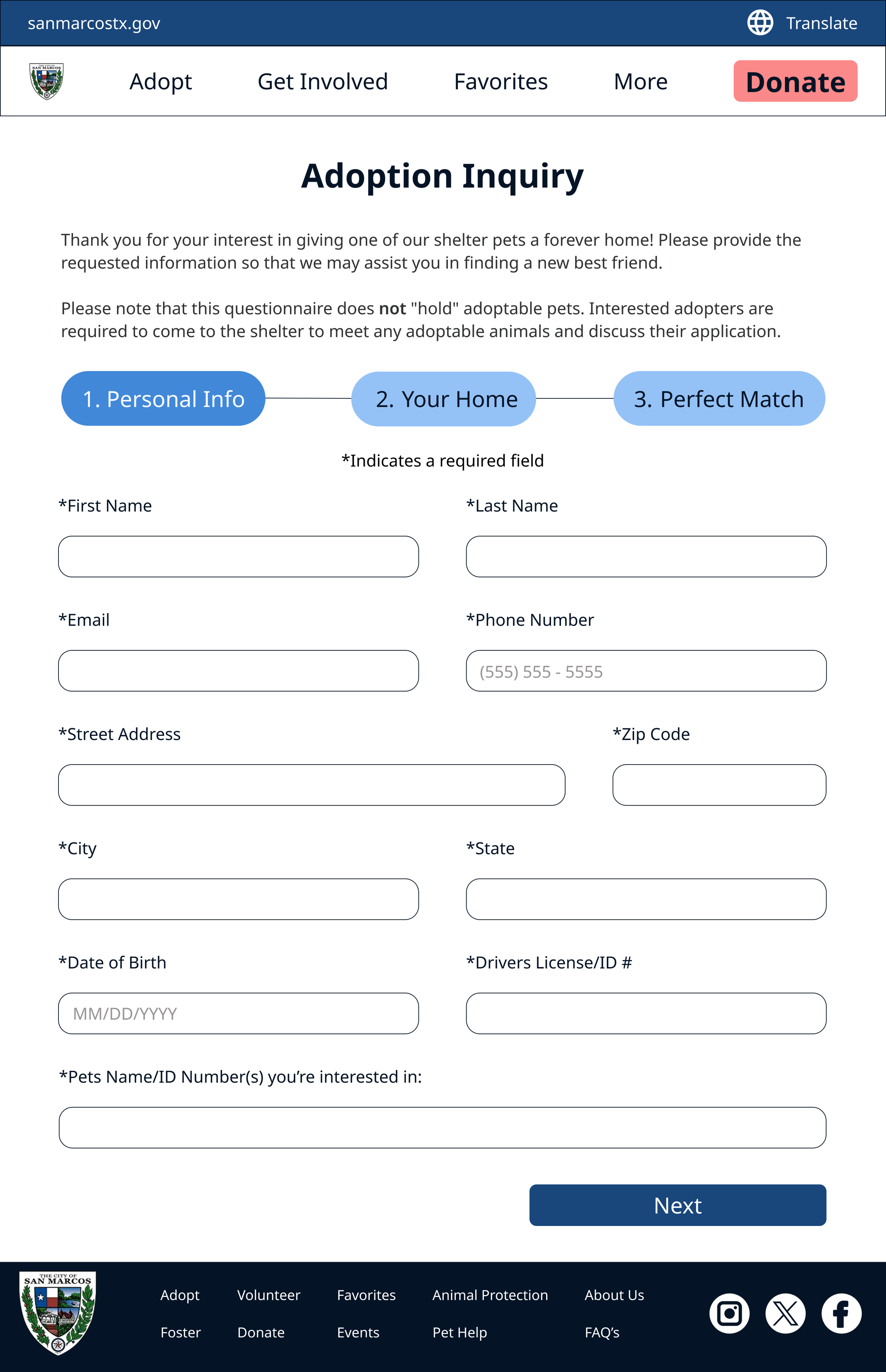
Final Prototype
Next Steps
Ensure the design is fully functional across all target devices and screen sizes, and verify accessibility features to guarantee the app is usable by everyone. After launch, collect user feedback through reviews, analytics, and support channels. Identify recurring issues or emerging challenges and use this feedback to make iterative improvements. Continuously refine the app post-launch based on real-world usage to enhance the user experience and address new problems.