

Find your new, favorite swimming location!


Role
UX/UI designer + Brand designer
Project Type
End-to-end UX design
Tools Used
Figma + Whimsical + Figjam
Timeline
3 months
The Problem
There are many places to swim, but how can you find out which ones currently have water? Is it safe to bring your dog or kids? The lack of information about the conditions at swimming locations makes it difficult for swimmers to choose the best spot to visit.
The Solution
We've developed an app that helps users find swimming spots. The app features recent photos of each location, along with key information such as parking availability and whether the spot is pet-friendly or family-friendly. Users can also share pictures and reviews, keeping others informed about the current conditions at each swimming hole.
Research Phase
Competitive Analysis
By identifying potential competitors, we were able to analyze their strengths and weaknesses. During our exploration, we discovered an app that listed swimming locations, but all the listings were overseas, with none available in the United States. We then analyzed three other competitors to better understand the opportunities for standing out in the market

We found AllTrails to be an excellent example of a comprehensive resource for finding outdoor locations, though it focused primarily on hiking trails.

Another app we examined, Outdoor Project, allowed users to explore outdoor activities and save their favorites. However, unlike AllTrails, it did not offer the option to upload pictures or write reviews.
Swimplaces allowed users to upload photos of destinations, ensuring the pictures were more accurate. However, it didn’t provide information about when the photos were taken. During our next research phase, we discovered that this was a crucial detail users wanted.
User Interviews
We interviewed five individuals: three males and two females. Four of the interviewees indicated they would be regular users, while one identified as a casual user.
“I’ve tried googling places or information, but sometimes it’s kind of like you really have to dig to try and find something or the information you want.”
- Swimmer
“I feel like it's just genuinely hard to find them. Like, just in general, it's not easy to research, and I feel like if you do research, it the same places just pop up. So it's really hard to, like, find new ones. Honestly, lack of information, or easy, accessible to find.”
- Swimmer
Insight: Lack of reliable information makes it difficult for swimmers to discover new places to visit.
“It’s nice to actually see what people's experience is like. So I'm a huge person who relies on reviews for everything, restaurants, anything, so I would definitely utilize it as an option.”
- Swimmer
“I would say it's super important... having reviews, or being able to have reviews and see them and read them gives you an idea if you want to go to that place or not.”
- Swimmer
Insight: One of the top priorities for users was the ability to view reviews and recent pictures from other users.
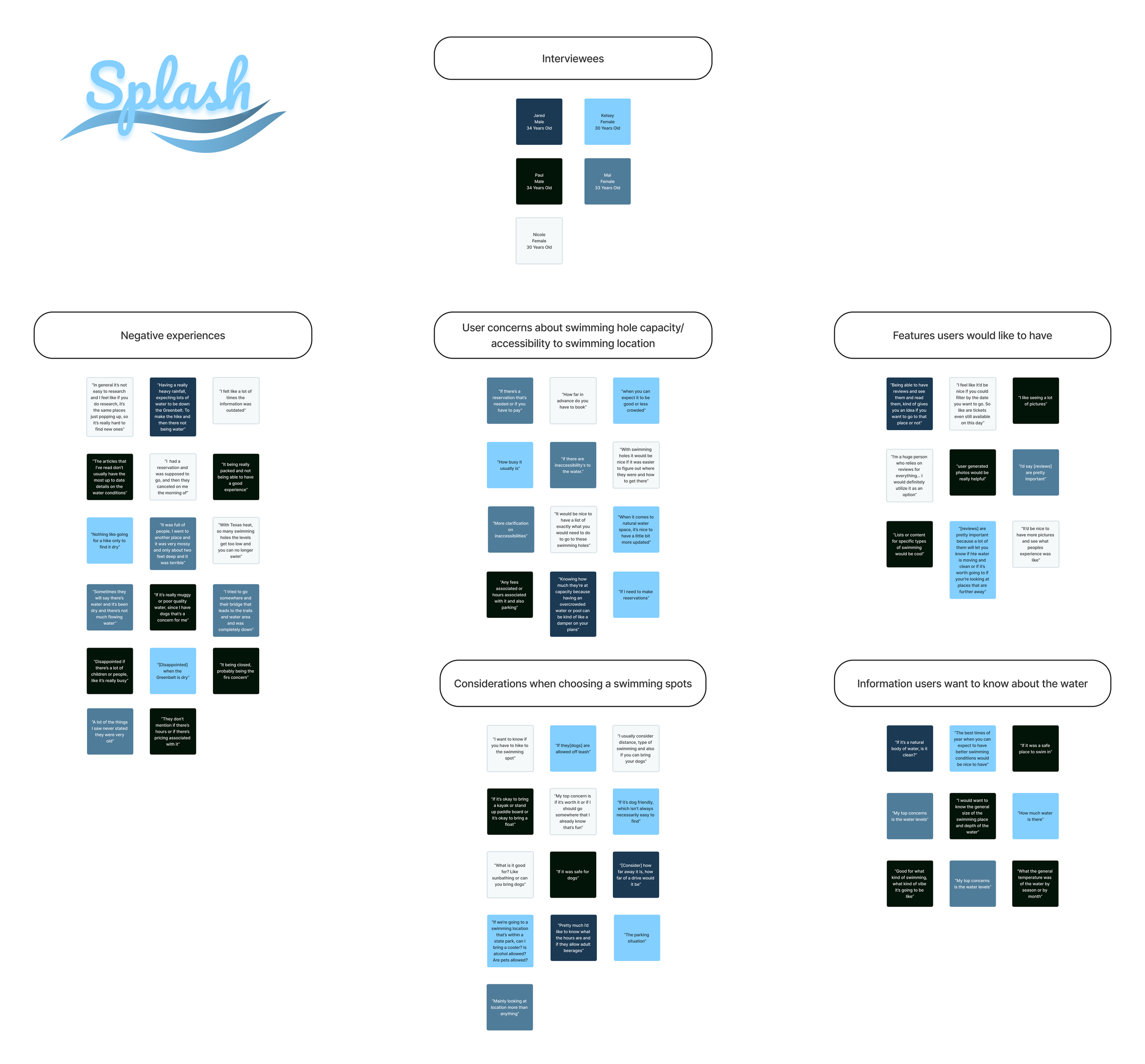
Through our user interviews, we discovered that swimmers often return to the same locations due to a lack of available resources. These findings align with our competitive analysis, highlighting a significant opportunity to create a solution that addresses this issue.
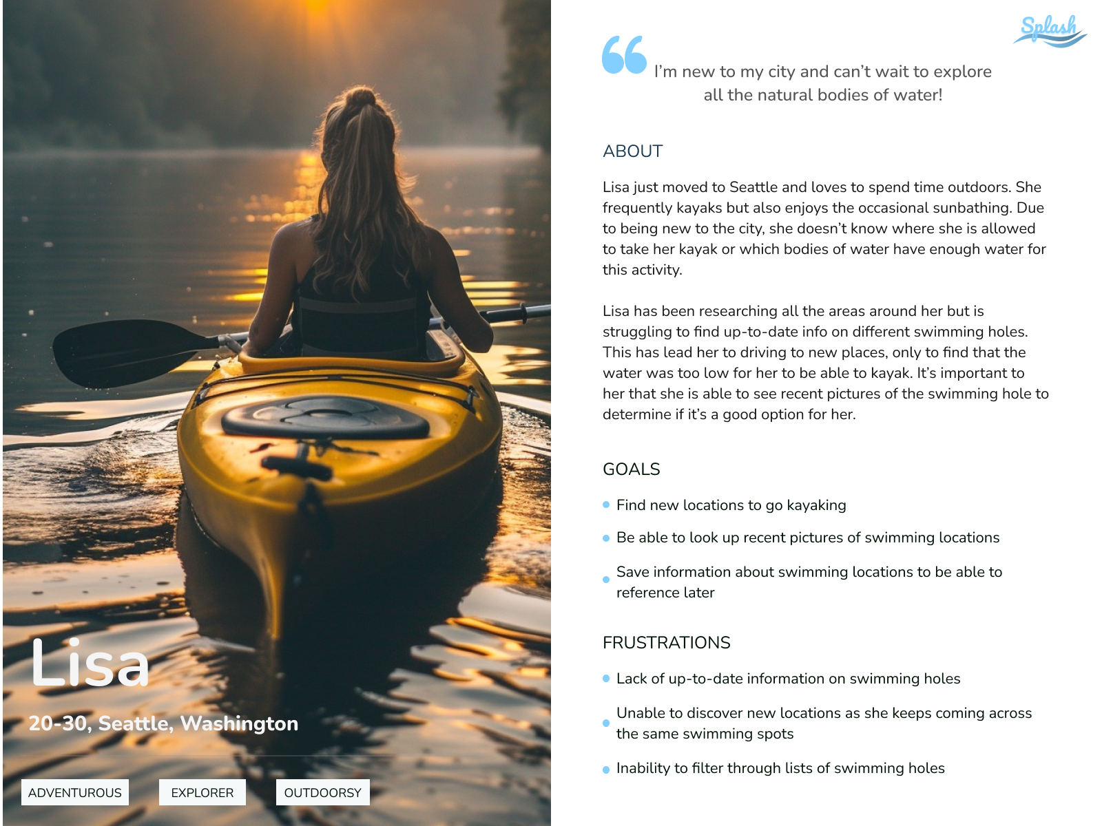
User Persona
We developed a user persona to ensure that, throughout the creation of Splash, we remained focused on our users' primary goals and needs. By defining a clear representation of our target audience, we were able to make informed design decisions that aligned with their preferences and pain points. This allowed us to prioritize features that would provide the most value and enhance the overall user experience, ensuring the app effectively addresses their key concerns and expectations.
Primary Persona
Ideation
POVs & HMWs
POV: We would like to develop a platform that connects users with up-to-date information on swimming holes.
POV: We would like to explore ways to increase the chances of users finding a swimming hole that fits their needs/wants.
How might we keep information as up-to-date as possible on the platform?
How might we ensure the users are provided with all the information they seek?
How might we organize the information to ensure users are easily able to access it?
How might we create a system in which users can help to keep information up to date?
How might we design a user-friendly interface that allows users to filter/search through the database easily?
How might we provide curated lists of swimming holes based on themes to help users find what they’re looking for?
How might we incorporate user reviews and photos to instill confidence in the accuracy and relevance of the information provided?
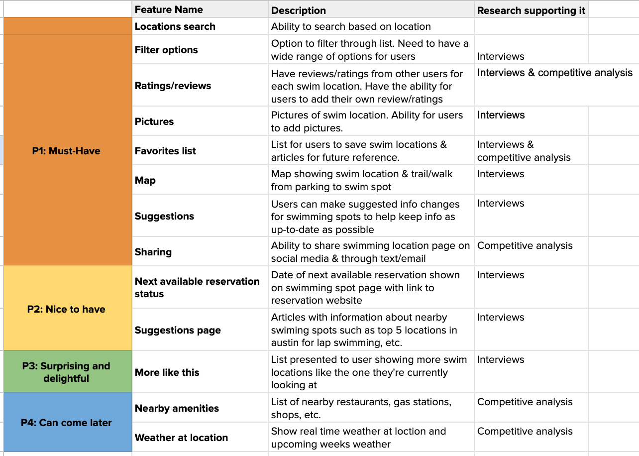
Features List
Considering our user persona was essential when creating a list of features for Splash. We categorized the features into four groups: must-haves, nice-to-haves, surprising and delightful, and can come later. This prioritization allowed us to focus on the most critical features that directly addressed our users’ needs and goals, ensuring the app provided immediate value. By distinguishing between essential and secondary features, we were able to streamline the development process and deliver a more focused and user-centered product.
Site Map
Creating a sitemap was essential to ensure a well-organized and user-friendly experience. By mapping out the app’s structure, we were able to clearly define how users would navigate between different features. This process helped us identify key user flows, prioritize important content, and streamline the app's design.

User & Task Flows
Both user and task flows were carefully developed to address the essential needs of our users, ensuring they could easily explore and discover swimming locations. By mapping out the steps users would take and identifying key touchpoints, we were able to create intuitive and efficient pathways that guided them seamlessly through the app, making the search for swimming spots as straightforward and enjoyable as possible.
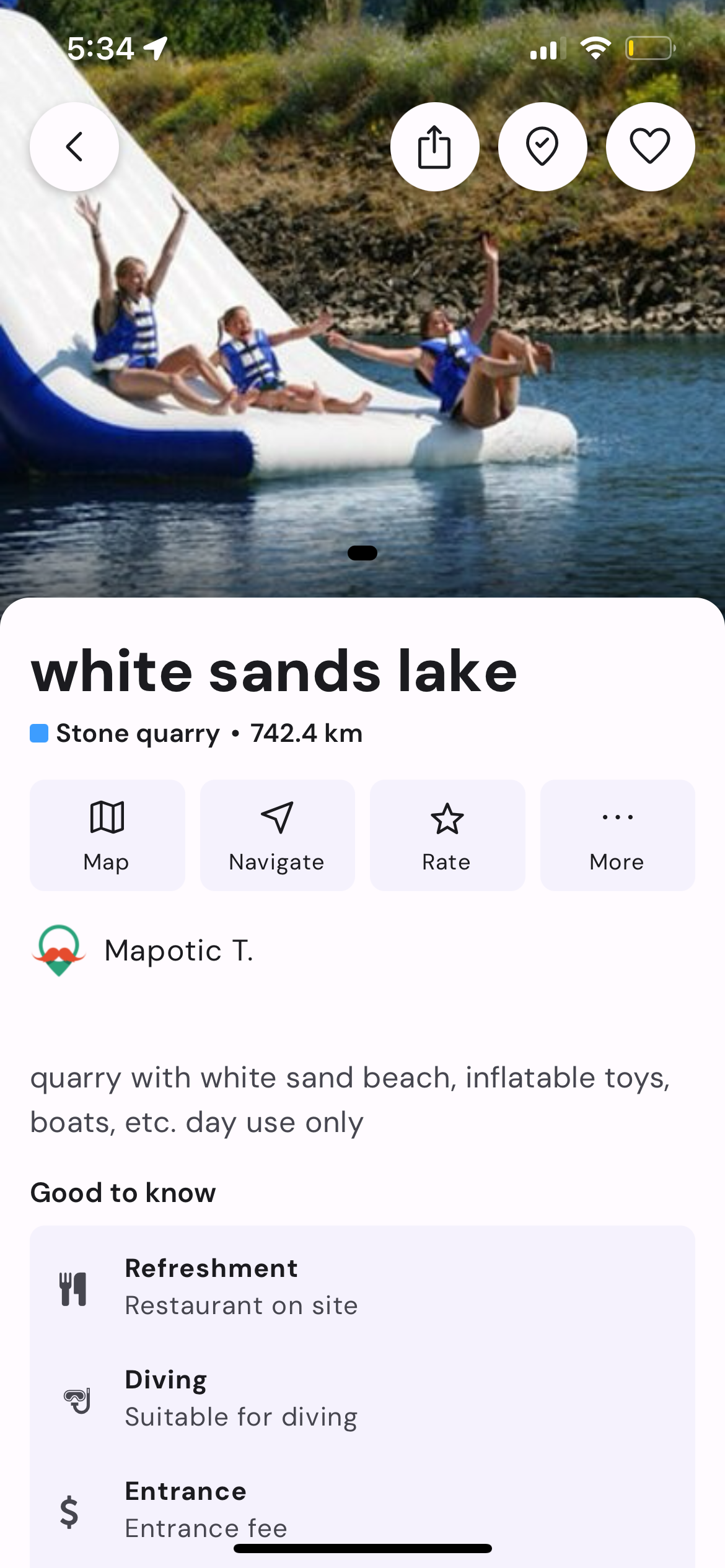
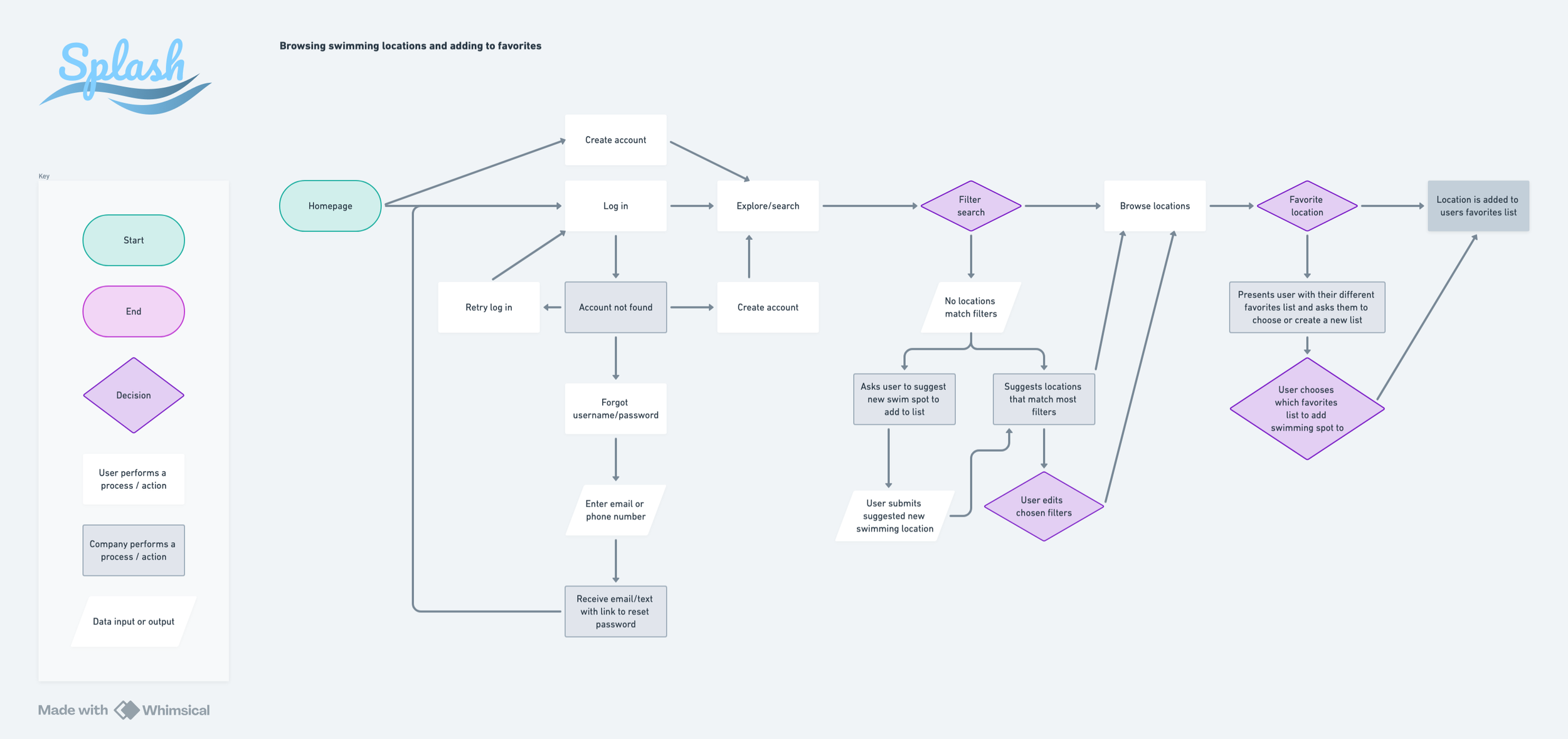
User Flow: Browsing swimming locations and adding to favorites
Task Flows: Find article to read. Search through favorites list

Wireframes & Prototype Testing
Low-fi wireframes
We began with basic wireframes and gradually refined them, evolving into detailed, high-fidelity wireframes and interactive prototypes for user testing.
We tested several low-fidelity wireframes to explore different design options and identify the optimal user flow. By prioritizing our users' primary needs, we discovered a more efficient way to organize essential information. Additionally, we ensured that our design aligned with business goals, with a particular focus on driving high user engagement.

By testing various layouts at the lowest fidelity, we were able to iterate on our sketches and create mid-fidelity wireframes using Figma. During this process, we discovered that some of our original ideas didn’t translate well into higher fidelity. One significant issue we encountered was the size of the images in the mid-fidelity wireframes, which appeared too small. To address this, we refined our initial concepts further.

Prototype Testing
Testing the mid-fidelity wireframes in a prototype was essential for identifying user pain points early in the process. By putting the wireframes into a functional prototype, we were able to observe how users interacted with the design, pinpoint areas where they encountered difficulties, and gather valuable feedback. This early testing allowed us to make informed adjustments, ensuring a smoother user experience as we moved forward in the development process.
Design & Branding
Mood Board
A mood board was created to ensure the app reflected our vision and communicated the right emotional tone. The tone we aimed for was a balance of reliability, trustworthiness, community, adventure, and inclusivity. By curating visual elements that embodied these values, we ensured that the design would resonate with users, fostering a sense of connection and excitement while maintaining a dependable and welcoming atmosphere.

Style Tile
A style tile was created to establish visual identity and ensure consistency throughout the app. We focused on developing a color palette that guarantees accessibility while reflecting our values.

Logo
To create a logo that accurately represented our company and its users, we began by sketching a variety of options. From these, we selected two designs to refine in Figma at a higher fidelity. Ultimately, we chose the logo that best embodies our core values.
Initial logo designs

Final logo design

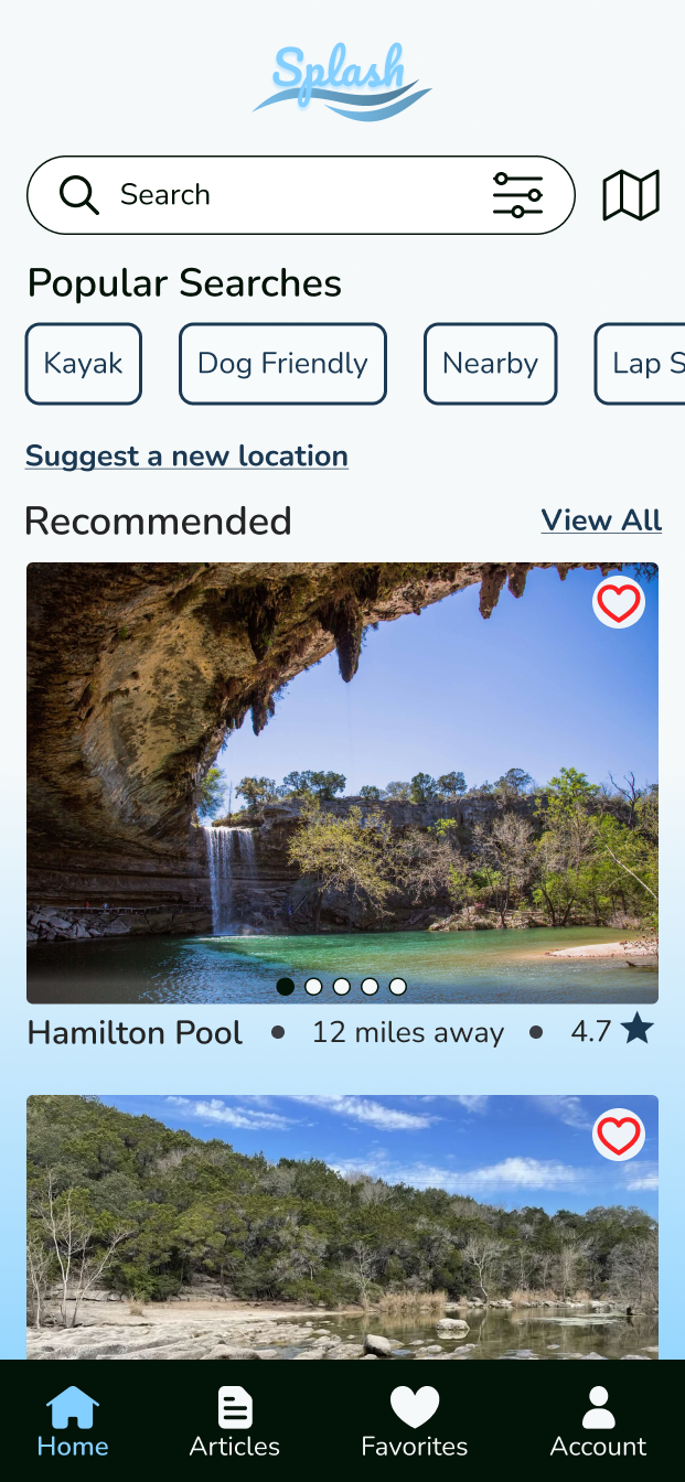
Hi-Fidelity Mockups
With the mood board, style tile, and logo finalized, we iterated on our mid-fidelity wireframes, always keeping the user in mind.
We enlarged the pictures to ensure they were clearer for our users. Additionally, we increased the spacing between UI elements to establish a stronger visual hierarchy.


Prototype Testing & Iterations
User Testing
Two user flows were tested during moderated Zoom calls. The first flow involved navigating from the home page to search for nearby swim locations, visiting a swim location's page, and adding it to a favorites list. The second flow required navigating from the home page to the articles page and saving a specific article. Participants were also asked to navigate to the favorites page to find the saved article and access the accounts page. High-fidelity prototype mockups for these tests were created in Figma. Moderating the tests was chosen to encourage more in-depth feedback and follow-up questions, enabling the collection of more detailed insights. Five participants took part in the tests, including four males and one female. Three identified as frequent app users, one as an occasional user, and one as an unlikely user.
User feedback revealed some challenges with the heart icon for favoriting Barton Springs, as well as confusion between the reviews and star rating buttons. Additionally, the "Suggest Edit" button was considered unintuitive, and visual hierarchy and white space could be improved. For the second task, users requested consistent save icons across swim locations and articles, and a few noted margin misalignments on the account page. Moving forward, the next steps include redesigning the save and reviews buttons for clarity, improving visual consistency, and addressing margin issues for a more intuitive user experience.
The results from these tests informed the iterations outlined below.
Problem #1: Users suggested increasing the size of the favorite heart, as they found it small and difficult to locate.
Proposed solution: The size of the favorite heart has been increased and repositioned slightly away from the edge of the image to enhance visibility for the user.

Problem #2: Users expressed confusion about the distinction between the review button and the rating button.
Proposed solution: The design of the review button was updated to enhance clarity for users.


Final Prototype
Next Steps
After launching the app, gather feedback on pain points, navigation issues, and preferred features to continually improve the design. Use analytics to track areas where users drop off or features that are rarely used. Regularly test the app with real users to refine the experience and maintain ongoing user engagement.