

Come back soon for more updates!

Orangetheory
A social feature that allows users to view their friends' class schedules and challenge them during their workouts.

The Problem
As an Orangetheory user, you enjoy coordinating with friends to attend classes together. However, the constant back-and-forth and lengthy group chats can become frustrating, often leading you to go alone or skip the class altogether. Orange Theory recognizes that users prefer attending classes with friends and is working to make this process easier. By introducing a social aspect to their platform, the aim is to increase membership by attracting new users and fostering long-term engagement.
Research shows that working out with friends can significantly boost motivation, accountability, and enjoyment. This is one reason why people love attending Orangetheory classes. These classes not only alleviate the stress of planning individual workout routines, but they are also scientifically designed to help users build strength and enhance endurance. So, how can users coordinate joining their friends in these classes?
Research
Interviews
We interviewed five Orange Theory users, consisting of two females and three males, all aged between 30 and 35. Their experience with Orange Theory varied from two to six years. Many users mentioned that it can be challenging to coordinate classes with friends, but they prefer to attend classes together whenever possible. Additionally, they enjoy participating in challenges with friends, as these challenges motivate them to push themselves harder during workouts and encourage them to attend more classes.

Competitive Analysis
In our examination of three different competitors, we noticed some key differences in their features. Two of the apps focused on individuals completing workouts independently, while one offered group class workouts similar to Orangetheory. The app for group classes did not allow users to view which classes their friends had signed up for. Although we identified some overlapping solutions among the competitors, none adequately addressed the current challenges faced by Orangetheory.
Narrowing Focus
After conducting research, we needed to identify the key elements to include in the new feature. Creating a list of features helped us ensure that this addition would meet user needs and align with our business objectives. We then developed user and task flows to guarantee that the feature would be easy for users to navigate. After testing various flows with our peers, we identified one that was simple and intuitive, providing an optimal experience for our users.
Project Goals
**Increase Memberships**
From a business perspective, this feature is designed to increase the number of users, thereby boosting profits and enhancing user engagement within the app. By developing a larger social engagement feature, we aim to foster a stronger sense of community, which will help keep users motivated and encourage them to maintain long-term memberships.
**Encourage User Engagement with the App**
We understand that people are often more motivated to achieve their fitness goals when they have a community working toward similar objectives. The aim of this feature is to make it easier for users to attend more classes with friends, increasing their motivation to participate and their drive to work harder during sessions. Additionally, users will be able to share their workout statistics with friends and compete in challenges, adding a fun and competitive element. Ultimately, both business and user goals align to make the workout experience more social and engaging.
Mid-fiTesting
Before moving onto hi-fidelity we needed to test out our designs with users to ensure we were going in the right direction. After countless sketches, we iterated on our top designs creating mid-fidelity prototypes we could use for user testing. Our goal when choosing designs was to ensure consistency with the current UI throughout the app. We also wanted to ensure the designs enticed the users to use the new feature.
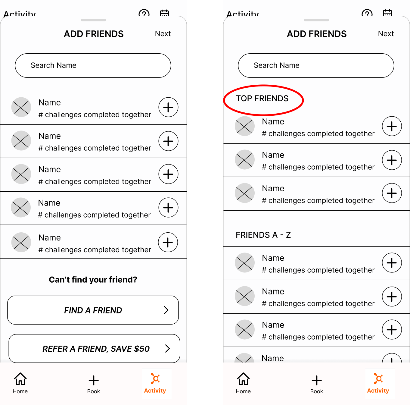
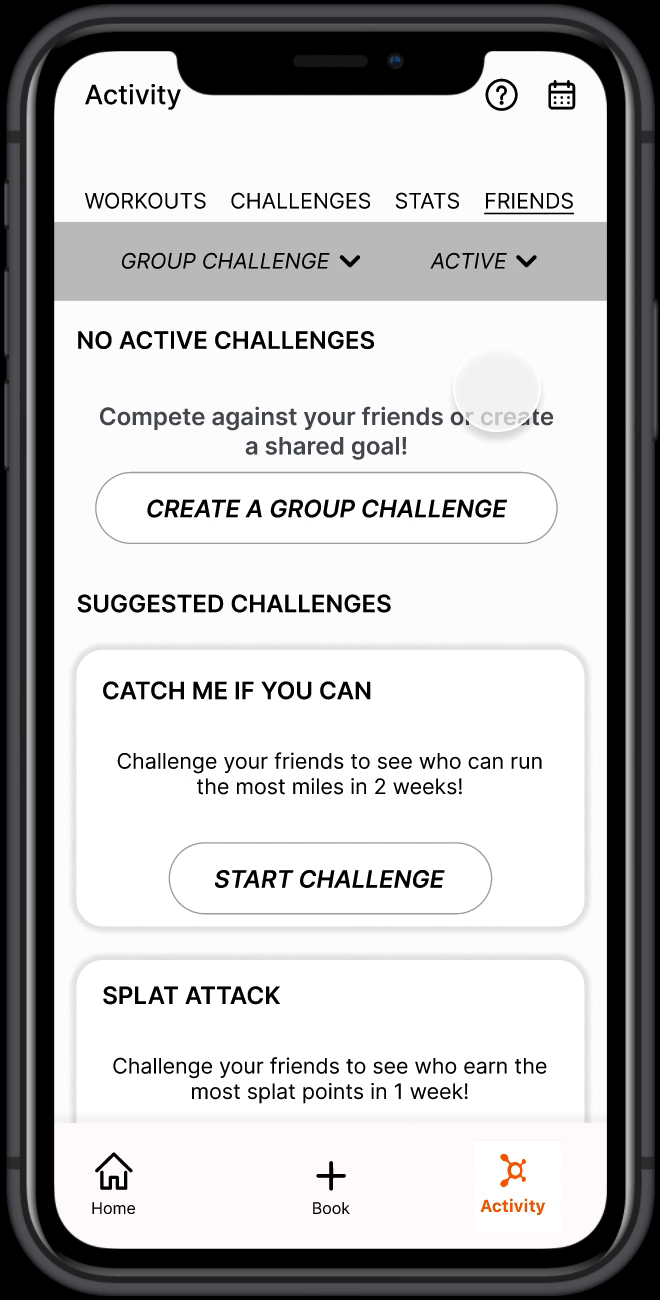
During the design process for the new feature, several key steps were taken to enhance user experience. There were several changes made when testing out mid-fidelity wireframes. To make it easier for users to select friends to challenge, we added a 'Top Friends' section at the top of the page, showcasing the friends they most frequently challenge, based on suggestions made during a group critique. Similarly, for the 'Choose Challenge' section, we incorporated a 'Suggested Challenges' section at the top, allowing users to quickly select their preferred challenge or goal.
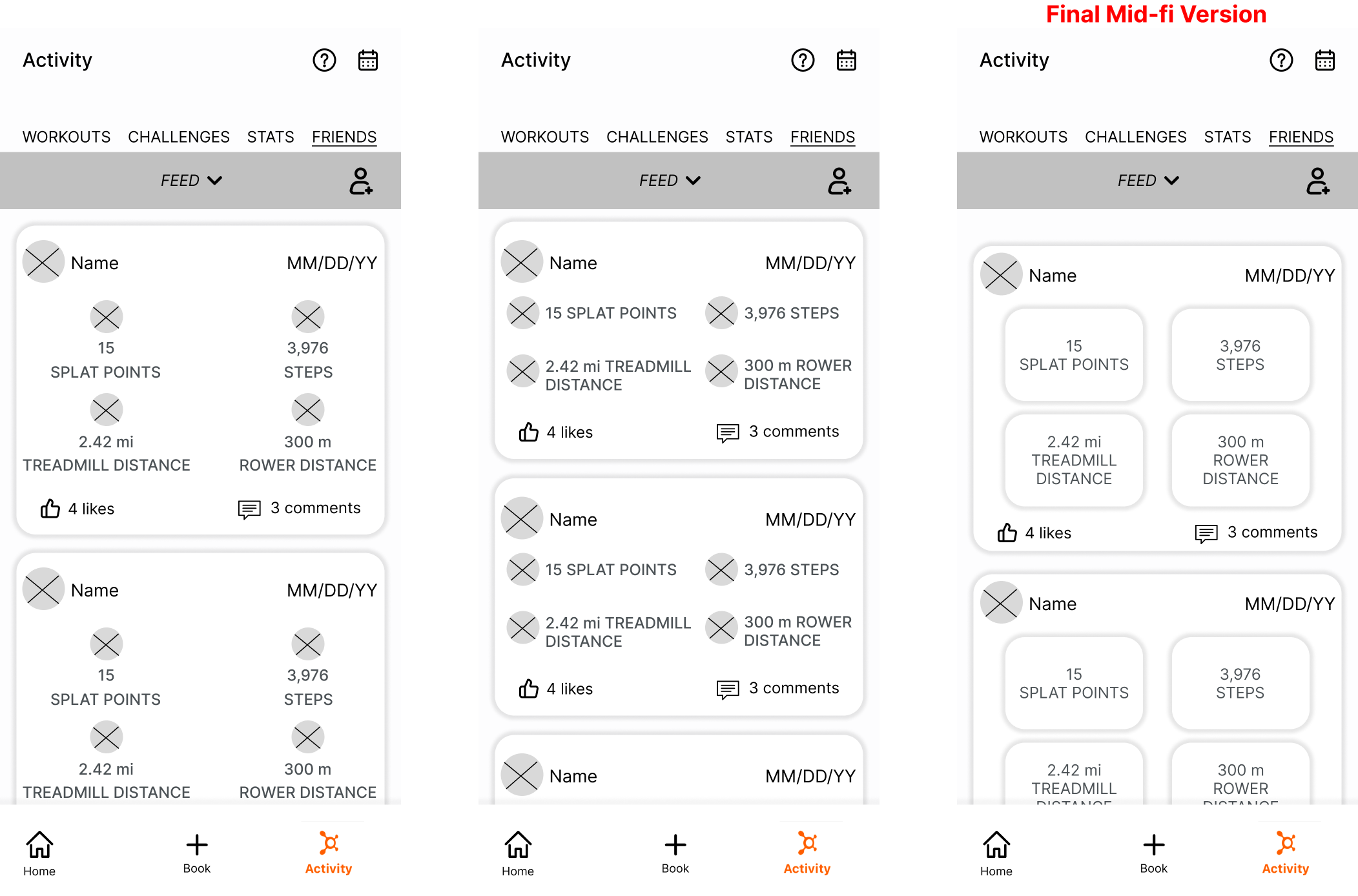
The Friends Feed page posed the biggest challenge due to the lack of similar UI elements in the app. To address this, we created multiple mid-fi wireframes based on initial sketches, which allowed for better visualization of spacing and sizing. After presenting these wireframes in a group critique, we gathered feedback that guided us in selecting the most effective design to move forward with.
During the mid-fidelity prototype testing, we conducted an unmoderated test with five participants using Maze. The first task required users to create a group challenge, while the second task involved two separate flows: adding a new friend and checking a friend's class schedule. Some confusion arose from combining these two tasks, so we decided to separate them for the high-fidelity testing phase. Overall, both tasks were generally considered easy to follow and navigate. However, it was noted that the 'Add a Friend' button was slightly small, which caused some users to take longer to locate it.
Task 1: Start a new challenge against a friend
Task 2: Add a new friend
Hi-fi Design
Orangetheory screenshots of existing features
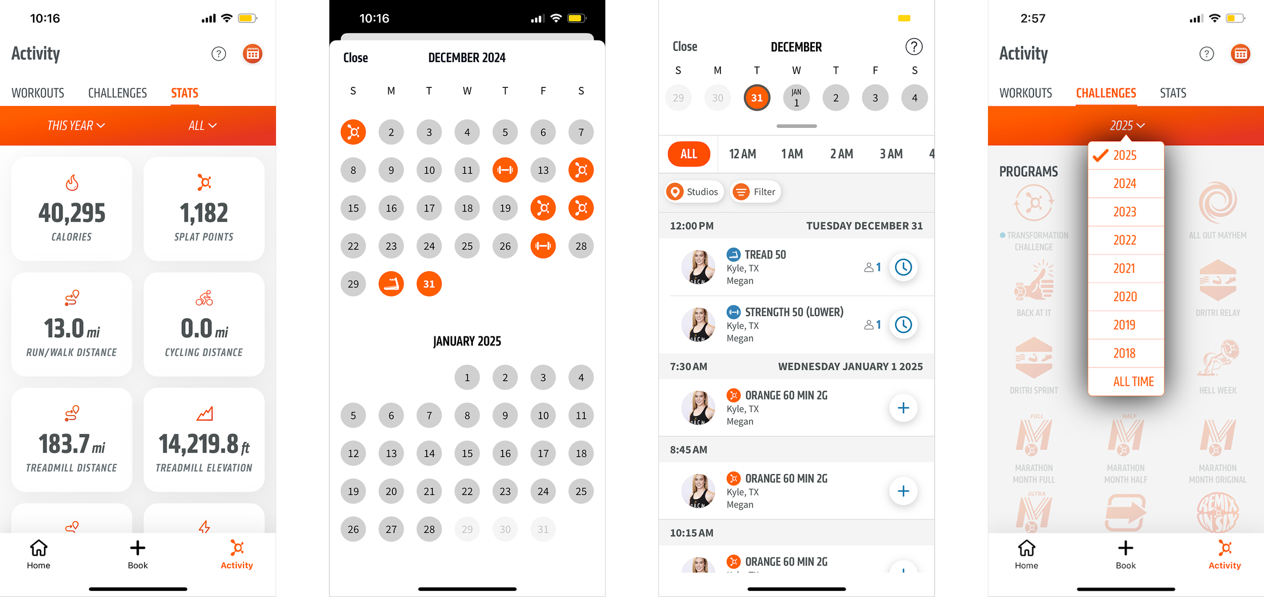
Screenshot of existing feature within app
It was crucial to maintain a consistent UI with existing features while creating the hi-fi designs. To achieve this, I frequently referred to screenshots of the app to ensure consistency.
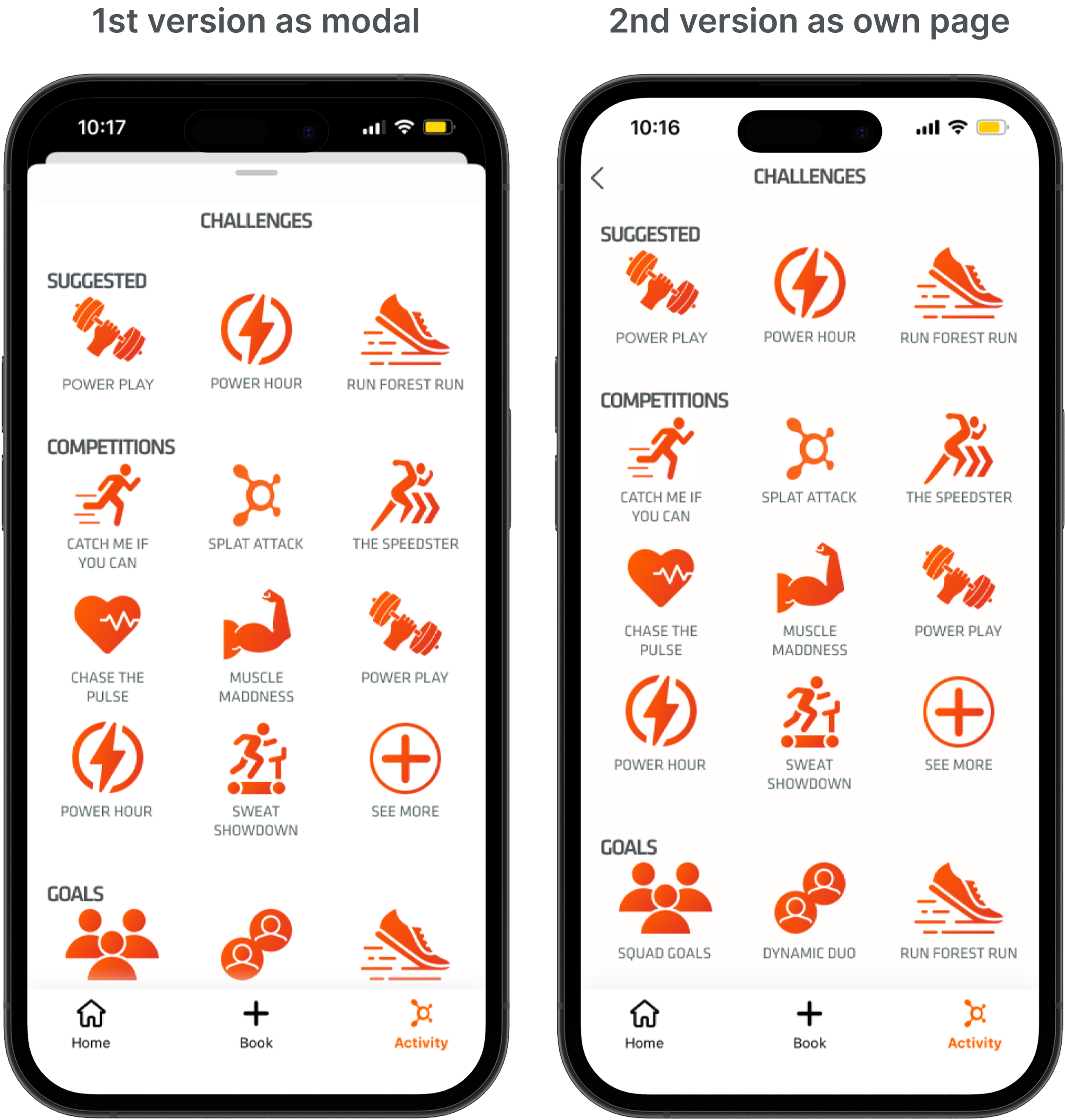
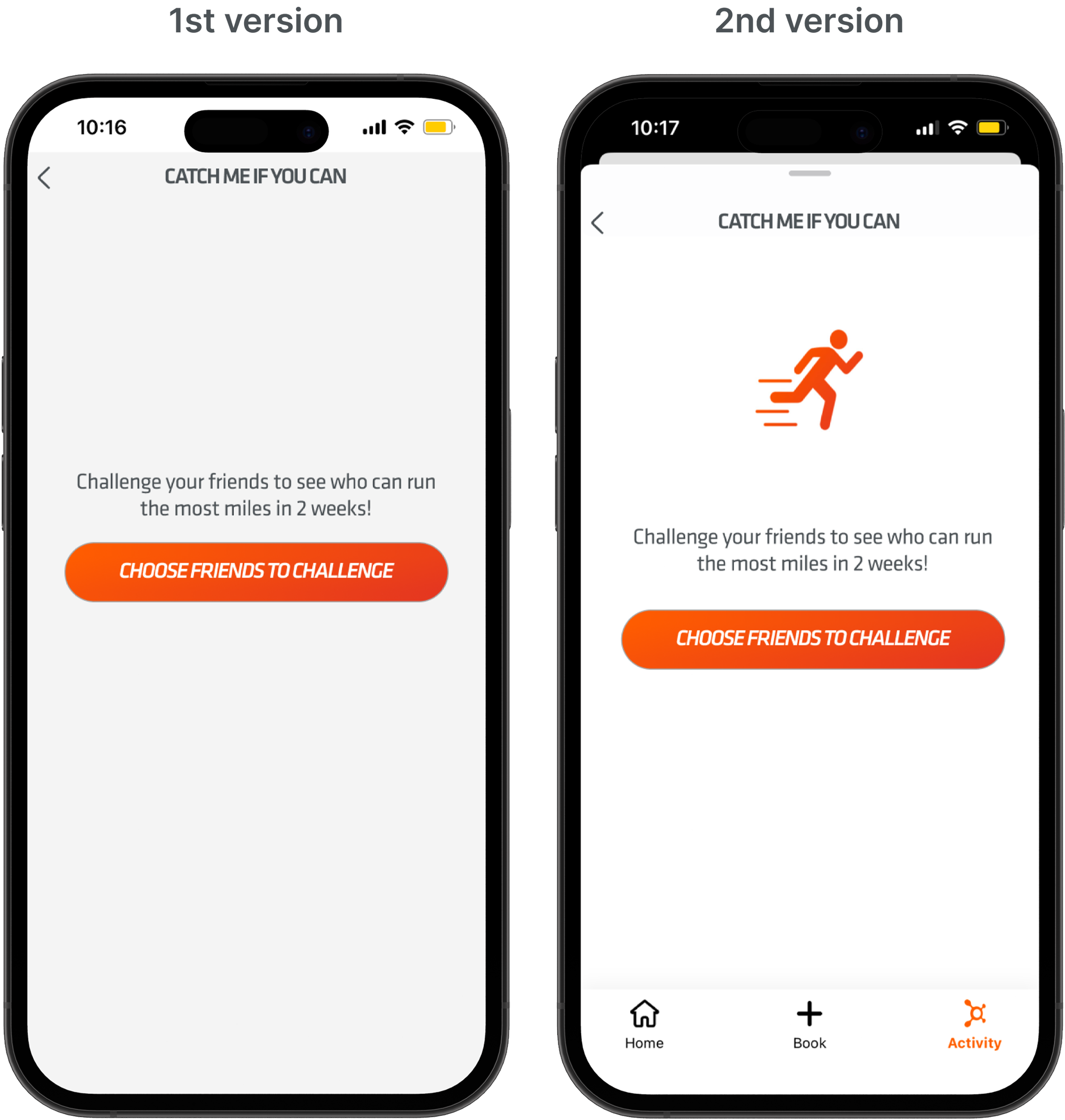
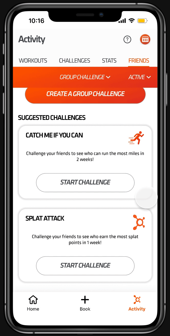
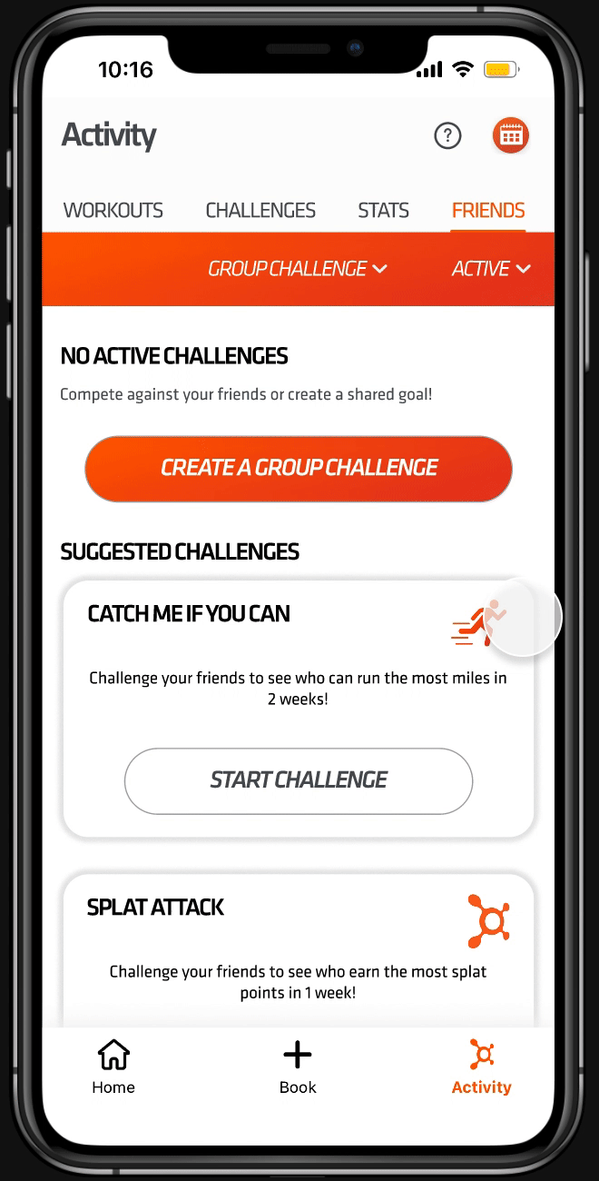
Originally, the 'Choose a Challenge' page was designed as a modal, but this led to excessive back-and-forth navigation when users explored different challenges and goals. To improve usability, I transformed it into a dedicated page featuring a modal pop-up that displays the challenge or goal description along with a 'Start Challenge' button when users click on a challenge or goal icon.
The 'Choose Challenges' page has minimal space between the group header and the logos. This was done to maintain a consistent UI with existing features within the app. While this design choice maintained consistency, if I were to continue working on this app, I would address the spacing issue across all areas for better visual clarity.
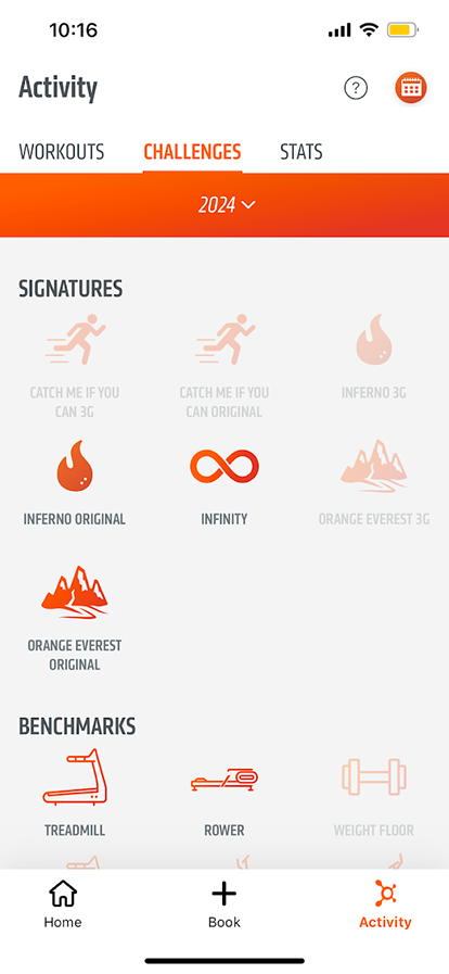
**This challenge feature, which is already in the app, consists of challenges that can only be completed by attending certain classes. This is done solo.**
Additionally, to enhance the challenge explanation modal, I added an icon to prevent it from feeling like a blank page.
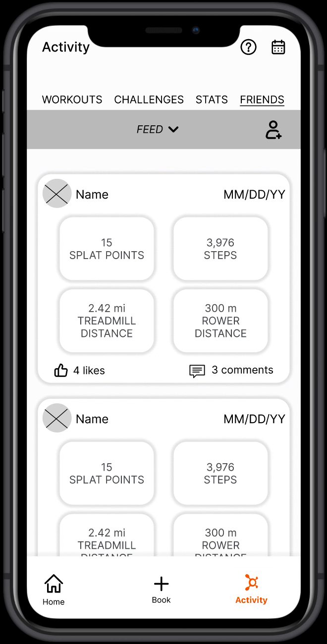
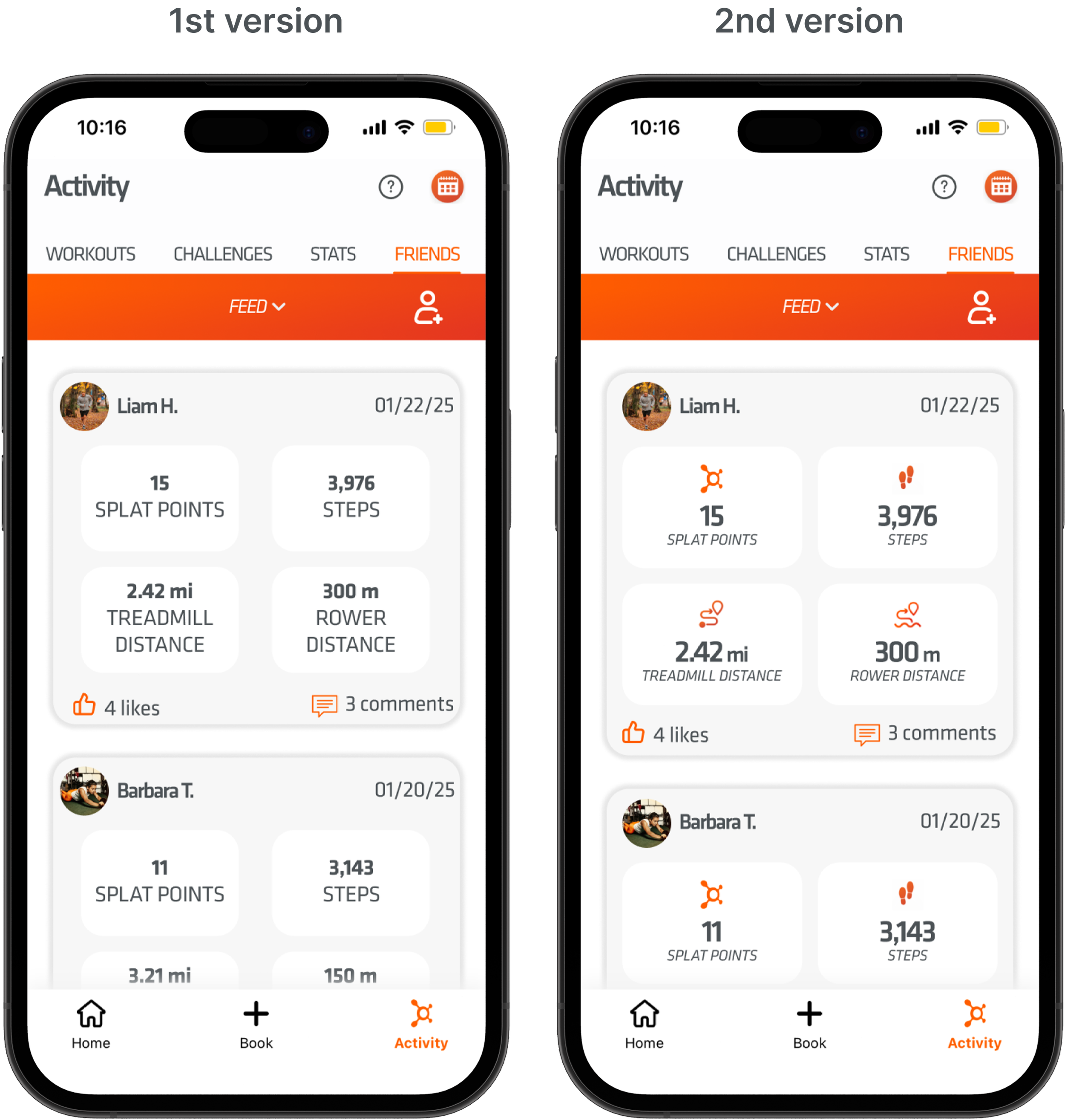
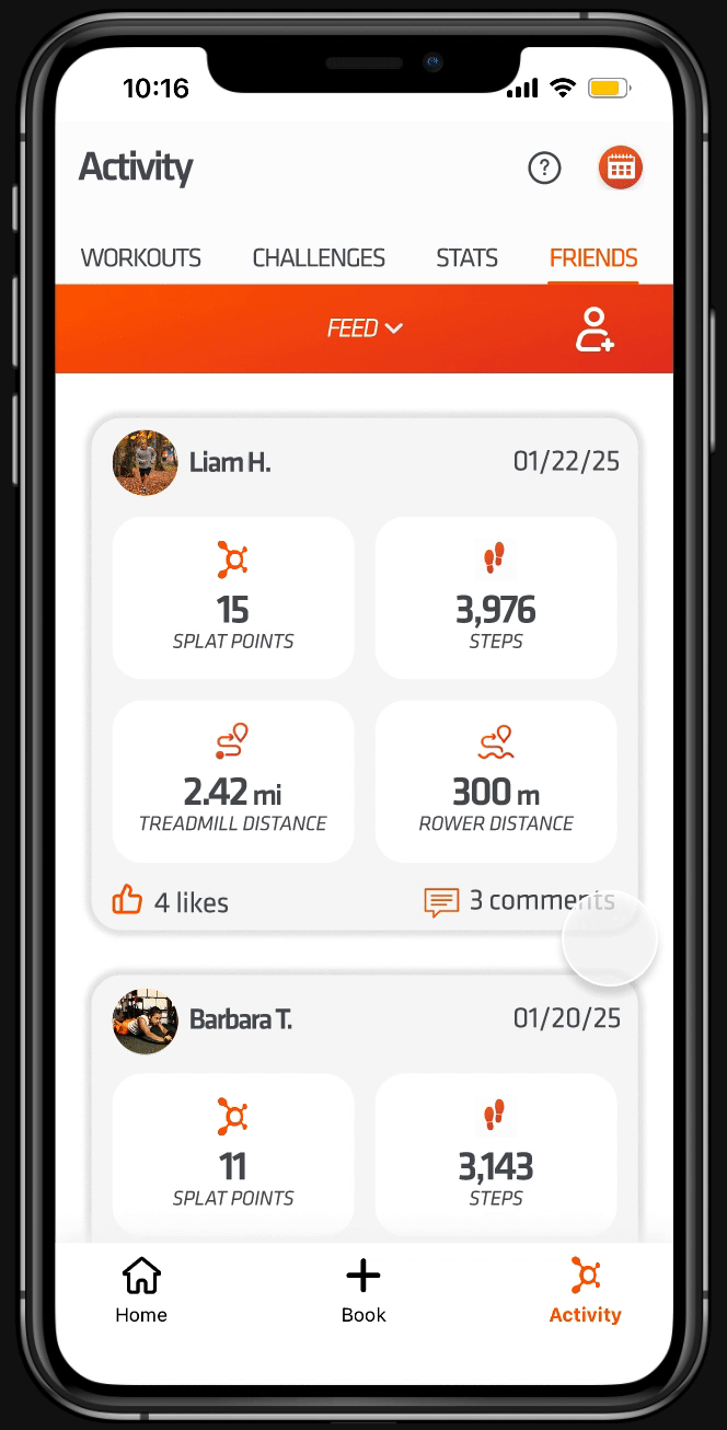
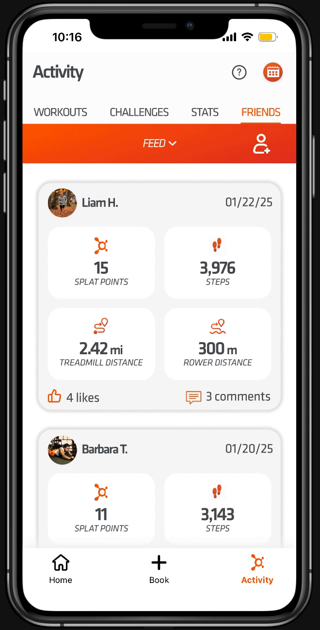
On the Friends Feed page, I incorporated icons next to the stats to align with the existing UI style found elsewhere in the app.
Hi-fi Testing & Iterations
For hi-fi prototype testing, we conducted unmoderated tests with 6 participants across 3 tasks using Maze.
Task 2: Adding a new friend saw a significant jump from 3.8 to 5, with users appreciating the intuitive UI.

Task 1: Starting a challenge improved from an average rating of 4.5 in the mid-fi prototype to 5 in the hi-fi, as participants found the flow logical.
Task 3: Checking a friend's class schedule went from 3.8 to 4.2, though two participants initially missed the dropdown menu. Since most users found this task easy, no changes were made.
Final Designs

Next Steps
Moving forward, we would collaborate with the marketing team to create a targeted promotional strategy for the new friends feature to ensure a successful launch. Post-launch, it will be important to monitor user engagement closely and gather feedback to inform future updates and improvements. By analyzing usage data, we can continuously refine the feature to better meet user needs. Additionally, we would conduct a thorough review of the entire app to address UI inconsistencies identified during the development process, such as spacing issues on the challenges page. Future enhancements could include adding a feature that allows users to upload a selfie with their completed workout posts and tag friends, as well as introducing rewards for completing goals and challenges. Another enhancement includes allowing users to filter through the available challenges and goals, enabling users to easily find activities that match their specific interests.